Which words do people have the most trouble spelling? We now have some insight into this question, based on a Google Trends analysis. Let's do a little fun analytics, and plot the results on a map!
But before we get started, let's go old-school for a minute. Before the days of computers, and spell-check, and the Internet - how did people determine the correct spelling of a word? I remember one of my teachers in high school always saying "look it up" - and she meant physically looking it up ... in a dictionary. Do you realize that a lot of the younger folks have probably never used a dictionary? Some might have never even seen one! I canvassed my friends, asking if anyone could send me a picture of their dictionary for this blog post, and my logophile friend Margie couldn't choose just one, so she sent me a picture of several:
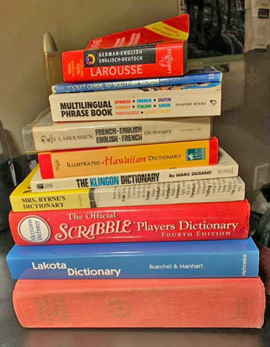
The Original
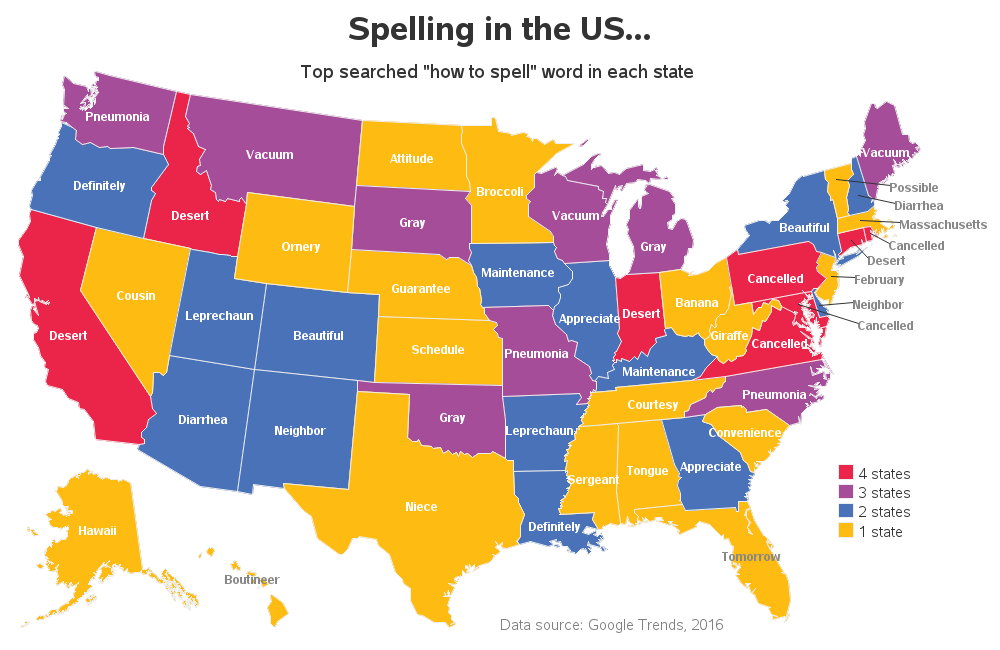
And now, back to the topic at hand! These days, spell-checkers are built into many of the computer applications we use. And what many people (including myself) do when unsure of a word, is we ask Google ... "How do you spell {word}?" And this allows Google to capture some interesting statistics. For example, here's a GoogleTrends map I saw on Twitter that shows the top searched "how to spell" word in each state.

My Imitation
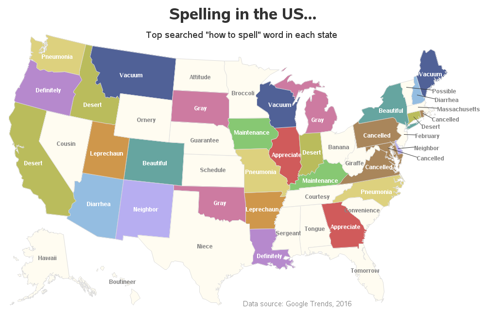
And of course being a Graph Guy, I felt compelled to create my own version of the map, with a few small enhancements. The proportions of their map were somewhat awkwardly wide, therefore I moved the title to the top, and tucked the legend into the white-space off the southeast US coastline. Now the proportions of the map fit the typical proportions of a page better. I also added a bit of interactivity - click the map image below to see the interactive version, with mouse-over text and drill-downs for each state:
I used the same colors as the original map, but the more I studied it, the more the colors bothered me. Although it was interesting to see an indication that various words were repeated in a certain number of states, I thought it would be more interesting to have different colors for each word.
My Enhancement
Therefore I created another version, using a unique color for each word that was repeated in multiple states (and words that were only the most common in a single state, I made a very light/subdued color). Now, for example, you can more easily see that 'Pneumonia' was the most common word for North Carolina, Missouri, and Washington.
I guess it all depends on "what question are you trying to answer with the data" ... but which version of the map do you prefer in general? What are some other ways you might like to see this data presented, to better answer specific questions? (feel free to share your ideas in the comments section) And here's a copy of the SAS code, if you'd like to experiment with it.


6 Comments
Made me smile that Hawaii was the most searched word in Alaska (searching for warmth maybe?) and boutineer in Hawaii (all the beach weddings?). Hmmm, I spelled "boutineer" just like the map but this comment window underlined it.......appears the word isn't even in the Outlook dictionary - no wonder people have to go to Google for the spelling!
Great observations!
It's "boutonniere"!!
🙂
Am I the only one laughing at Massachusetts?
And I feel ya Nebraska, I can't spell guarantee either (I got the little red wavy line when I tried to type it here).
That's the spirit! 🙂